Fixing onboarding when the funnel was at risk
WHEN THE OUTBOUND CHANNEL BECAME UNSTABLE, ONBOARDING TURNED INTO A CRITICAL OPERATIONAL STEP TO PROTECT REVENUE.
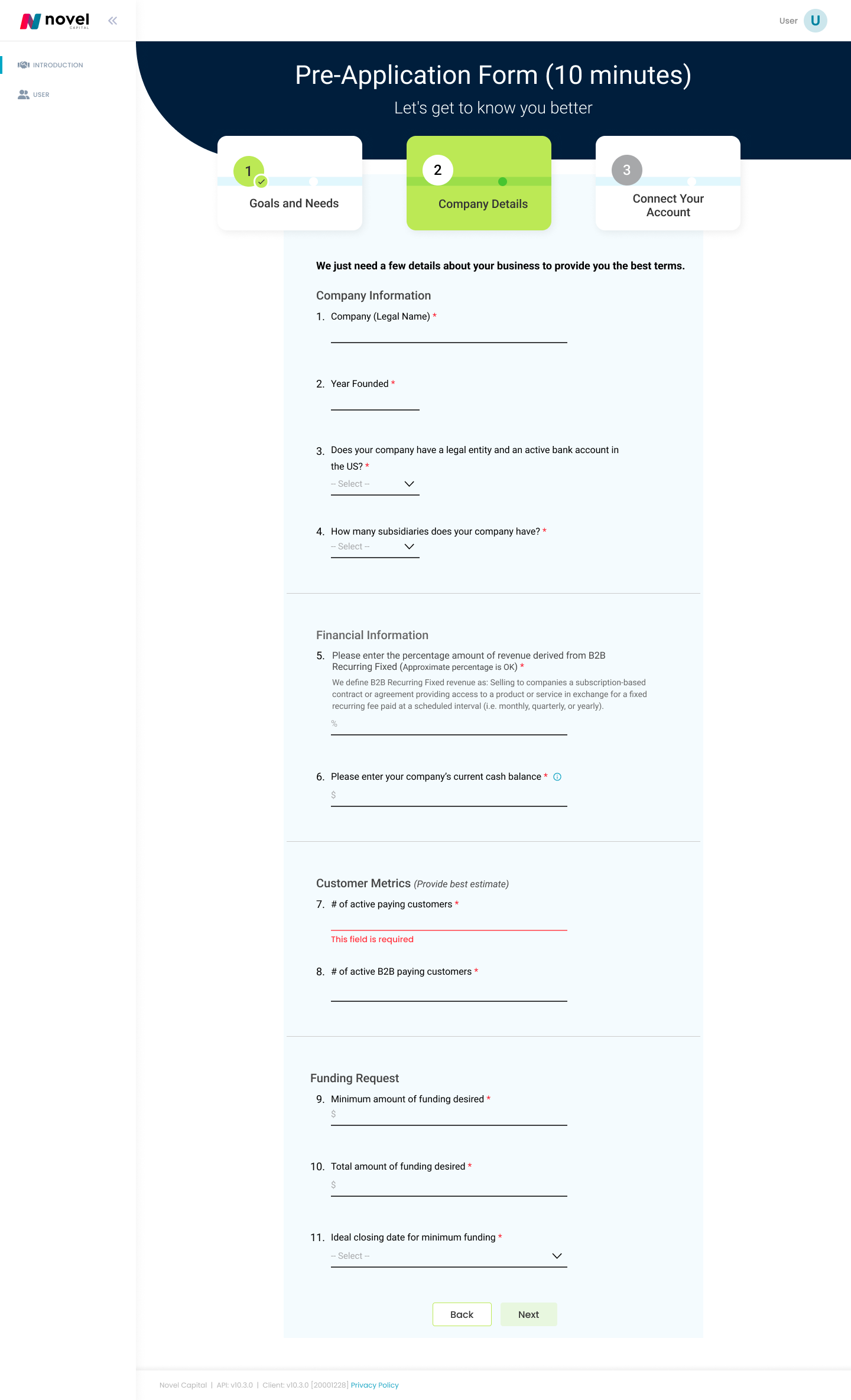
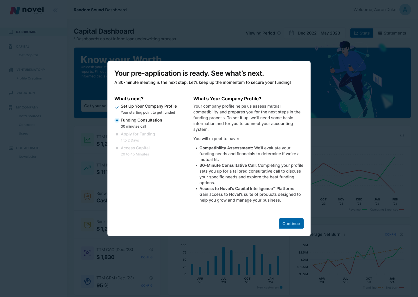
I redesigned an integrated flow combining registration, the brief intro call (BIC), and scheduling into a single progressive experience, reducing early cognitive friction and aligning the process with users' actual financial readiness. Brief Intro Call form (BIC) completion increased by 15% without compromising eligibility criteria.
THE REAL PROBLEM
The initial onboarding was asking for too much information too early. Founders and CEOs were dropping off the process or pausing it for hours, and sometimes days, when they faced questions that required deep financial knowledge. The pattern was consistent across 120+ Hotjar session recordings.
HOW COMPLEXITY WAS HANDLED
From demanding immediate certainty to enabling fast, progressive advancement with human support. Complexity wasn't eliminated; it was redistributed to the right moments along the funnel.
IMPACT
There is no clear
way to schedule
a support call
Customers can
easily reach
support any time
reducing friction
Improved clarity for Sales and Support teams when assisting customers.
Eliminating visual and mental resets across the onboarding experience
uncertainty
+15% Completion
Increasing BIC completion without compromising eligibility criteria
What didn't fit in the short version
Trade-offs, constraints, and decisions
Business context
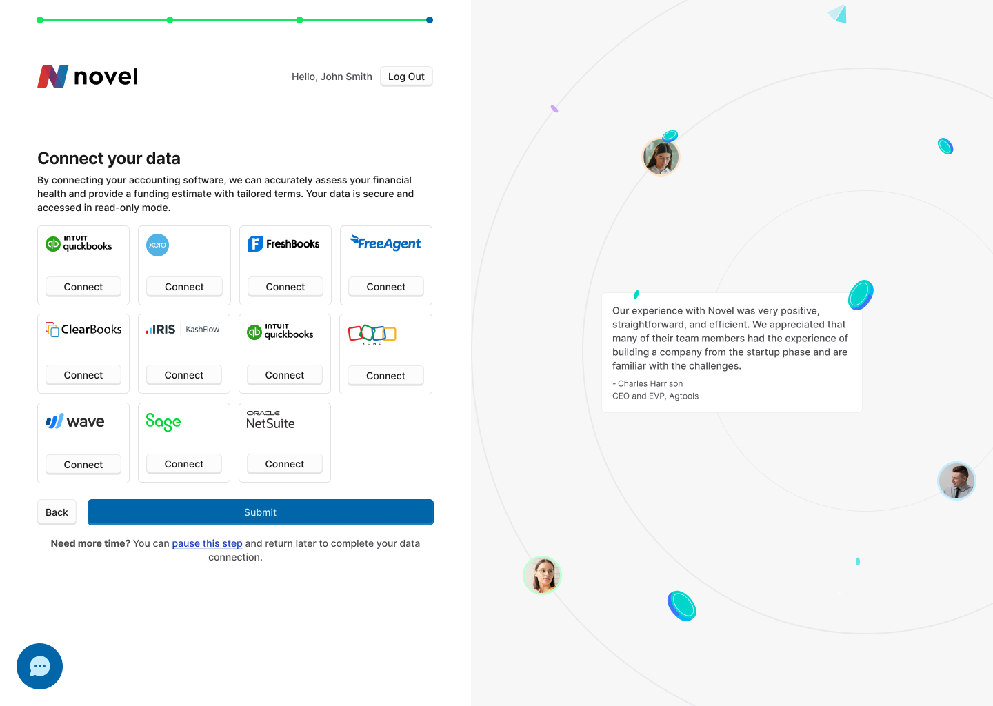
Novel Capital strongly depends on the outbound to acquire customers. When the deliverability of this channel got affected, each SQL became critical to protect the pipeline and runway. The onboarding stopped being just a formality and happened to be a direct critical point to the business.
Observed Problem
The onboarding flow assumed a high level of financial expertise from the very first interaction.
After reviewing more than 120 Hotjar session recordings, a clear pattern emerged: founders and CEOs frequently dropped off or paused the process midway through the BIC flow.
These pauses often happened when users were asked for financial information they didn't have readily available, turning onboarding into a blocking task instead of a progressive entry point into the product.
Key Design Decisions
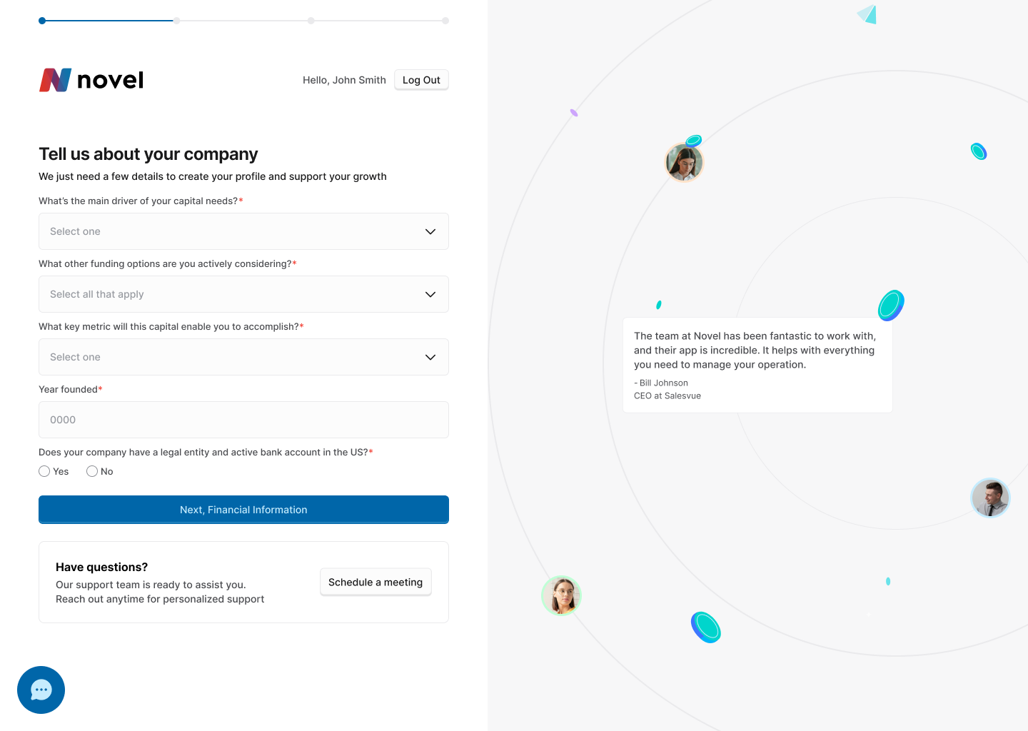
1Visual consistency with the core product
The onboarding experience was aligned with the existing dashboard UI, avoiding the feeling of entering a separate or disconnected product during the first interaction.
2Flow unification to build continuity
Registration, the BIC form, and scheduling were combined into a single progressive experience.
This reduced mental fragmentation, created familiarity, and allowed users to move forward without unnecessary resets.
3Clear hierarchy to support decision-making
Mandatory actions, optional steps, and support options were clearly differentiated.
This allowed users to continue without getting blocked, while still having access to help at any point in the process.
Constraints & Trade-offs
This project was executed under real operational constraints typical of a growing B2B fintech product. Instead of blocking progress, these constraints shaped how risk was managed and where design effort created the most impact.
No direct access to formal user research
User insights were inferred through behavioral data (Hotjar session reviews) and frontline feedback from Sales and Support.
Partial metrics and limited post-launch data access
Success was measured using proxy indicators and qualitative signals rather than full-funnel analytics.
Strong dependency on Sales and Support for qualitative feedback
These teams acted as primary insight providers, requiring careful interpretation of biased but high-signal input.
Predefined technical integrations and infrastructure
Key integrations (Chili Piper, authentication flows, internal APIs) were fixed, constraining solution space and sequencing decisions.
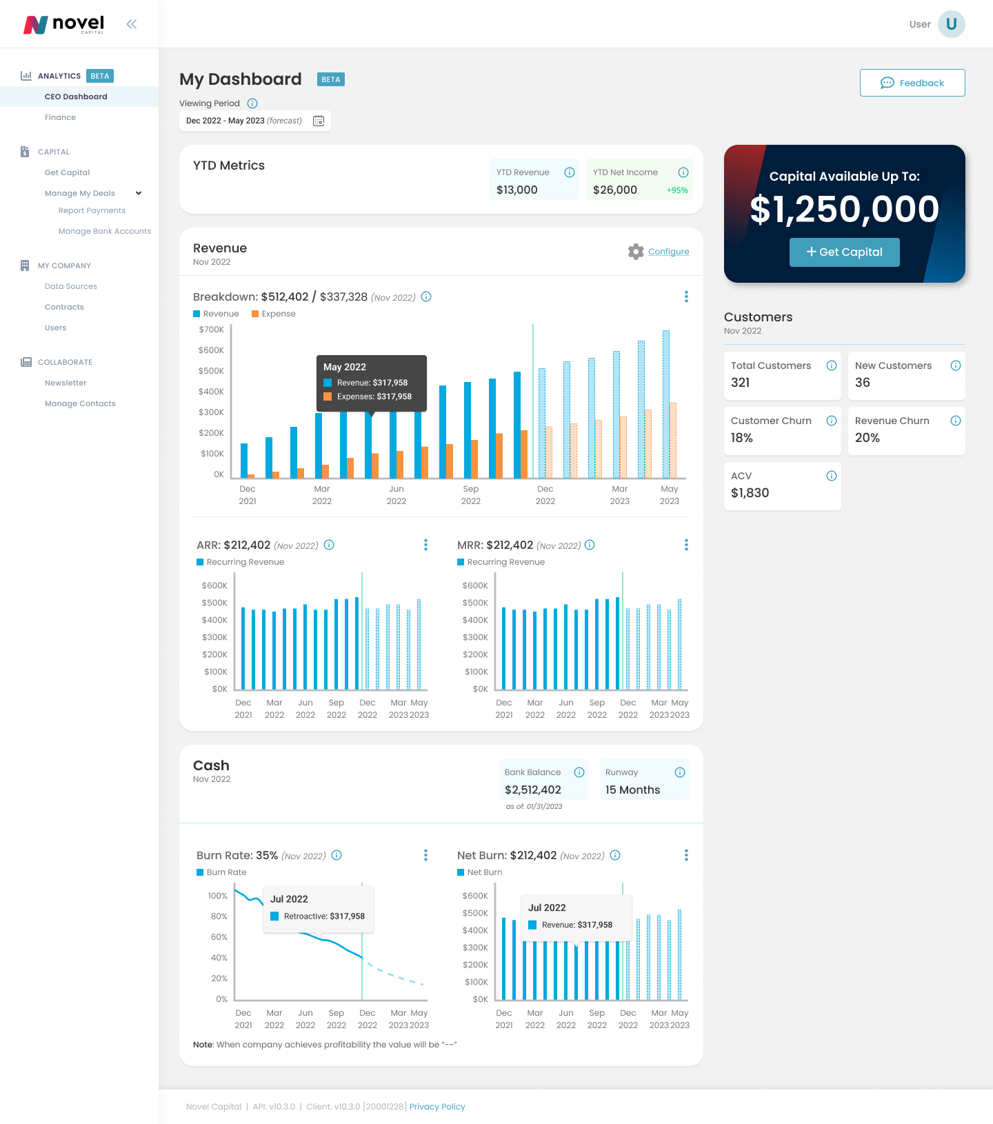
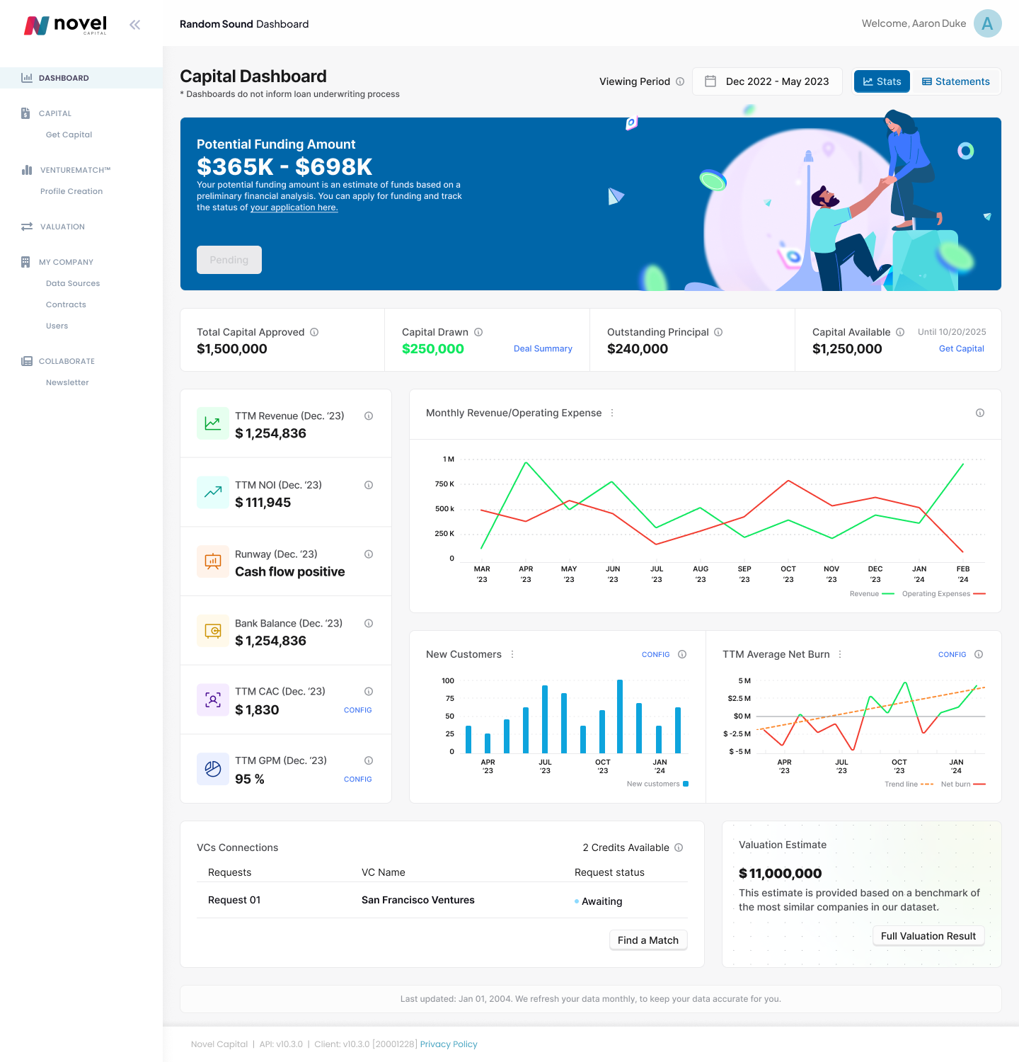
The dashboard had been built incrementally by engineering, leading to inconsistent patterns and unreliable financial data. As a result, users struggled to trust the product, making decision-making harder than it should be.
I redesigned the dashboard to bring structure and clarity, focusing on three things:
– A consistent UI foundation across key areas
– Clear hierarchy for financial metrics
– Alignment between displayed data and accounting sources
This work restored trust in the product and established a foundation for future features. It also enabled improvements, including onboarding, to build on shared patterns instead of starting from scratch.
BEFORE IMPROVING ONBOARDING AND CONVERSION, THE PRODUCT LACKED A COHERENT FOUNDATION. THE DASHBOARD BECAME THE FIRST STEP IN ESTABLISHING A CONSISTENT STRUCTURE, RELIABLE METRICS, AND A SHARED VISUAL LANGUAGE ACROSS THE PLATFORM.